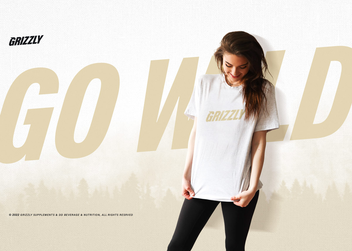
The things
we shape,
shape us.
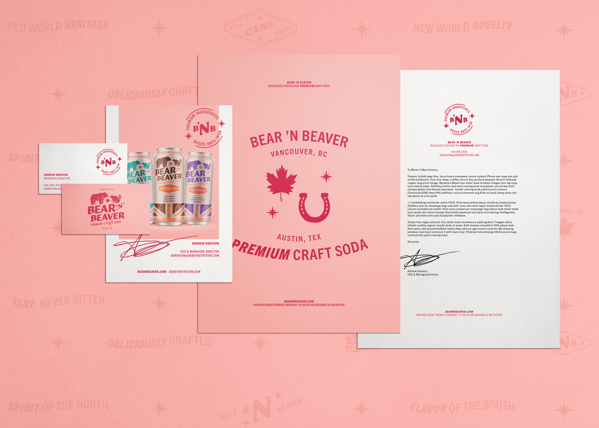
The creative process cuts both ways. As we pour ourselves into our work, that work leaves its design in us. We’re excited to see how your project shapes up.
New Business
© 2024 Groundwork Design, LLC.
The creative process cuts both ways. As we pour ourselves into our work, that work leaves its design in us. We’re excited to see how your project shapes up.
New Business
© 2024 Groundwork Design, LLC.